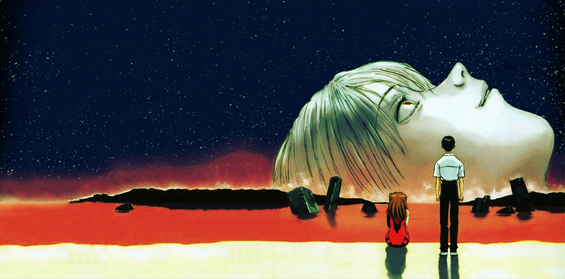
A trailer for Star Wars: Visions arrived earlier this week, an advertisement for the series of nine anime-inspired shorts set within the Star Wars universe.
Visions itself isn’t revolutionary. As my esteemed colleague Matt Razak has noted, it is very much expected for major brands like Star Wars or Star Trek to extend their storytelling into animation. Visions won’t even be the first Star Wars animated series; George Lucas’ beloved space opera has already spun off into well-received cartoons like The Clone Wars or The Bad Batch. Still, the trailer for Visions was breathtaking and bold.
The Star Wars: Visions trailer stood out because it’s rare to see a studio like Disney take these sorts of stylistic swings with its major brands like Lucasfilm and Marvel Studios. The trailer was aggressive and confident, demonstrating the wide range of art styles and aesthetics bringing these stories to life. The nine shorts will be split across seven different animation studios: Kamikaze Douga, Geno Studio, Studio Colorido, Trigger, Kinema Citrus, Science Saru, and Production I.G.
There is an obvious point of contrast here. With the first installment of Star Wars: Visions dropping in late September, it will overlap neatly with the tail end of What If…?, the first official animated spin-off from Marvel Studios. Superficially, What If…? offers a premise that is not miles removed from that of Visions, promising viewers a glimpse into versions of the Marvel Cinematic Universe radically different from those portrayed in the live-action films.
However, What If…? feels frustrating as an animated spin-off. Much has been made of the symbolic importance of What If…? as an animated show within a universe derived from comic books. Roy Schwartz at CNN suggested that What If…? felt “like a comic book or storyboard come alive,” while Ethan Anderton at /Film argued that the animation made the show “feel like a comic book brought to life,” and Geeks of Doom critic Michael Lee claimed the show felt “like a comic book in motion.”

This stock comparison suggests a frustratingly narrow idea of what comic books should look like. After all, one of the beautiful things about mainstream American comic books is the sheer range of art styles on display: Tim Sale’s painted interiors, Alex Ross’ photo likenesses, Dave McKean’s impressionistic nightmares, Mike Allred’s cartoonish designs, and a myriad of styles in between. In contrast, What If…? has a single animation style, one that is frustratingly generic.
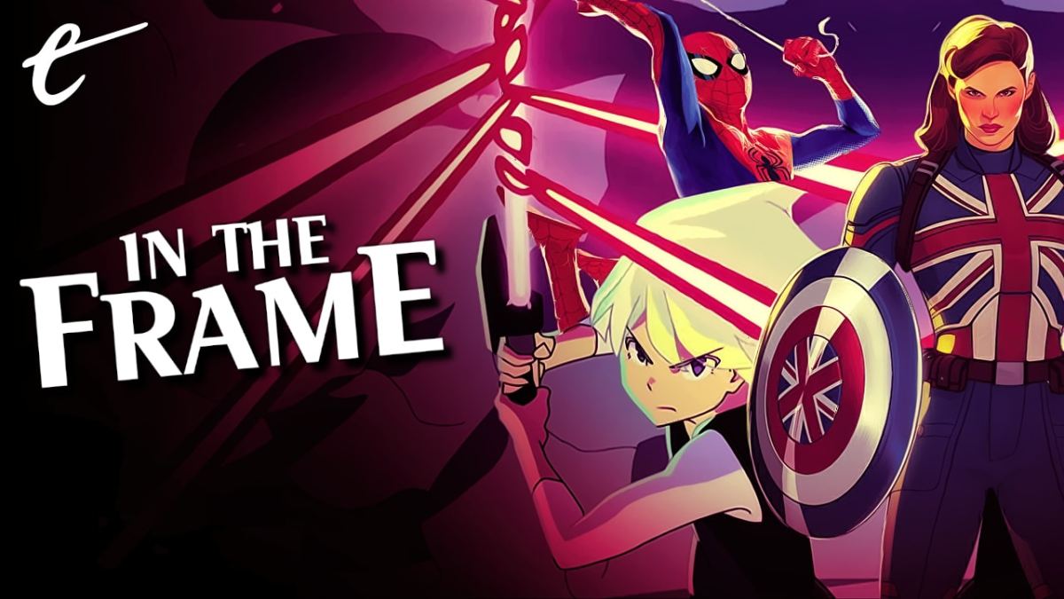
What If…? uses cel-shading, an approach that renders 3D animated objects in two dimensions. For this series specifically, the style is intended to emphasize the likeness of its models to the original actors who played these characters in the live-action films. Fidelity is hugely important to What If…?, the constant reassurance to audiences that they are watching a “real” part of this gigantic shared universe.
It isn’t enough that Hayley Atwell reprises her role as Peggy Carter; Peggy must still look like Atwell. Even with Josh Keaton assuming the role of Steve Rogers, the character is still animated to look like original actor Chris Evans. Despite playing the second lead in the season premiere, Keaton’s name is omitted from the episode’s opening credits. In contrast, returning actor Stanley Tucci gets an opening credit for a handful of lines. Apparently, Keaton’s name doesn’t sell the fidelity.
There is a trade-off for this fidelity. The models in What If…? are not particularly expressive. After all, cartoons tend to have exaggerated facial features to allow for a greater range of expression. In its own weird way, What If…? suffers from a version of the problem that haunts the live-action Marvel Cinematic Universe: the imposition of a bland house style that favors consistency above all else. The animation style is just an extension of the films’ flat visual style or generic scores.

This is particularly frustrating in the context of What If…? because animation offers limitless potential. For example, Spider-Man: Into the Spider-Verse is another animated adaptation of a classic Marvel property that explores the multiverse. Into the Spider-Verse uses its animation style to differentiate its alternate universe and tones in playful and creative ways that demonstrate animation as a medium with a fundamentally different set of strengths than live-action filmmaking.
In Into the Spider-Verse, Peni Parker (Kimiko Glenn) is animated like an anime character while Peter Porker (John Mulaney) is designed like a Looney Tunes cartoon. More than that, the animated film is able to deliberately evoke particular art styles. In particular, the film’s version of Wilson Fisk (Liev Schreiber) looks like he stepped out of Bill Sienkiewicz’s work on the graphic novel Daredevil: Love and War. This is particularly obvious during the movie’s heightened and stylized flashbacks.
There is no reason why What If…? cannot be similarly creative or ambitious in its visuals. Although there has been no official budget confirmed for the show, reports suggested that the first wave of MCU shows would have “budgets comparable to a Marvel film project,” and showrunner A.C. Bradley has boasted that the studio didn’t want “these stories to be constrained by budget.” The series’s bland visual style is a choice.
It didn’t have to be that way. As time marches on, the Wachowkis’ ambitious and deeply flawed attempts to build a transmedia storytelling universe around The Matrix feel like a clumsier but more adventurous prototype for the model that modern studios use in trying to grow their own franchises. The Wachowskis imagined an entire universe of video games, comics, and animated shorts all flowing out of (and feeding into) the Matrix films.

In the context of this new wave of animated spin-offs serving to expand fictional universes, The Animatrix feels very much like a touchstone. Lana and Lily Wachowski were both big fans of anime, and their work on The Matrix had been inspired by that passion. So, when given a chance to flesh out the world of the movie, they immediately latched on to the idea of animation. The project was conceived as a potential television series but evolved into a set of nine animated shorts.
These shorts were assigned to veteran animation directors who enjoyed relative autonomy in realizing their vision within the world of The Matrix. Mahiro Maedo, who directed the two “Second Renaissance” shorts, talked about how important it was that the Wachowskis encouraged him “to work on [his] own style.” Andy Jones, who directed “The Final Flight of the Osiris,” insisted that the Wachowskis wanted all the individual pieces “to be their own stylistically.”
Rewatching The Animatrix years later, it is striking how distinct and unique the individual shorts feel. The animators each take a different approach to realizing their vision. Some of the shorts use conventional 2D animation, while others use rendered 3D models. Some of the shorts feature relatively grounded and verisimilitudinous animation, while others are more aggressively stylized. There is no single house style. Instead, there is just imagination.
There were other attempts to emulate this approach. In the gap between the release of Batman Begins and The Dark Knight, Warner Bros. released an anthology animated film titled Batman: Gotham Knight that invited several different animation studios to bring their own stylistic sensibilities to bear on the Caped Crusader. Critics affectionately dubbed it “Batmanime.” However, this trend never entirely caught on.
Star Wars: Visions seems to have adopted a similar approach to The Animatrix and Gotham Knight, embracing a variety of different animation styles to tell stories within the larger Star Wars framework. This is welcome. Sadly, for all the potential of What If…?, the show’s visual imagination seems limited.


Published: Aug 20, 2021 11:00 am